Tutorial Tuesday: How to Use Digital Backdrop Textures
Welcome to this Tutorial Tuesday about How to use Digital Backdrop Textures. There are a few reasons why I LOVE adding textures to my digital backdrops. One is BANDING. If you aren’t familiar with banding, it’s this terribly annoying photoshop problem that comes from working (or saving) in a color space that is finite (8 bit, 16 bit, you can find it in both). We’ll dive in deeper on banding another day, but suffice it to say, it’s the WORST. It shows up in your pictures in areas with varying color depth in a single color space (like on a seamless backdrop).
Another reason I love digital backdrop textures is for cohesiveness in a gallery. When I’m taking a lot of different pictures on a seamless backdrop, I’m moving my subjects around and I’m often repositioning my lighting as well, depending on where I have my subjects and how many there are. THEN when I get them all in photoshop, my background can look fairly variable- especially in exposure, but also to a degree in color.
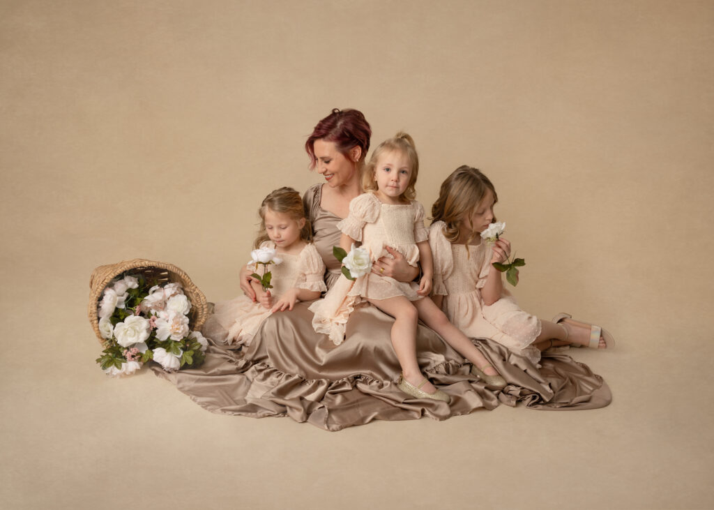
As a product focused photographer (I believe pictures should be hanging on your walls or enjoyed in albums, not sitting on your phone), my goal is to create art that my clients can hang in a big gallery wall. To make this look the best it can, I want my backdrop to look as uniform as possible from one photo to the next.
CUE DIGITAL BACKDROP TEXTURES
Adding in a digital backdrop texture hides the minor differences in color and exposure, and gets rid of banding! Two seamless backdrop hurdles in one. With no further ado, here is a tutorial on how to use a digital backdrop texture.
How to Use Digital Backdrop Textures by Rebecca KayneIt’s always best to begin by cleaning up the backdrop as much as possible.
Here are a few of my favorite digital backdrop packages. You can find a lot of them on Etsy. I do recommend looking through the user review pictures first to make sure they look natural in use.
Also not mentioned in the video, in using a digital background texture it’s best to stick with a color and tone that is similar to the background your subject is photographed on. For instance, if I have my subject on a blue backdrop then I’ll want to use a blue digital background texture. Using a different color can make the picture look fake, which we definitely want to avoid.
I hope you enjoyed this week’s Tutorial Tuesday! Please comment with any questions or tutorial requests.
